Considered one of U.S. soccer’s lower tier’s historical franchises — the Pittsburgh Riverhounds, founded in 1999, unveiled a striking new crest on Friday that gives tribute a number of different things.
And here you have it, the unveiling of @PghRiverhounds new crest… pic.twitter.com/V8opaTLw4m
— John Krysinsky (@PghSoccerScribe) February 17, 2018
At a season ticket holder event at Highmark Stadium, the crest was revealed — as the soccer club swapped out the long-time “Hounds head” logo – the trademark of the club since 1999 – for a traditional badge look to coincide with an off season of growth and change.
Here’s the video that was played…
#NewEraUNLEASHED pic.twitter.com/qsNKy921IT
— Pittsburgh Riverhounds SC (@RiverhoundsSC) February 17, 2018
![]()
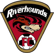
The first look at the crest shows a slightly busy emblem that is pretty determined to pay homage to a bunch of different things from the City of Pittsburgh’s official black and gold crest, to bridges, the rivers, to a paw print as an ode to the Hounds, a soccer ball, because, well, they’re a soccer team — and of course the name Pittsburgh Riverhounds SC connected by the bridge artwork.
But hey — that’s just one reporter’s initial assessment.
As another person who got an early look at this remarked to me — “It’s very Pittsburgh!”
Indeed, there’s been a lot of build-up and excitement for the Hounds this off season, and on Friday, we saw the kickoff of a symbolic ‘new era’.
They’re now a member of the burgeoning USL, which confirmed its place as the second division of professional soccer in the states and will be complimented by the planned expansion of Highmark Stadium to 5,000 seats.
“Tonight was meant to be a celebration of the excitement for not only the upcoming season, but also our fans and their support of this club over the past couple years,” Riverhounds SC owner Tuffy Shallenberger said. “This logo, this new era, has been something I’ve wanted to give the fans for a long time and I couldn’t be happier to see it all finally become a reality. We hope everyone can see the passion and dedication that went into this entire process, as we look to continue to build on and off the field and become part of this city’s rich sports culture.”
Here’s the official explanation from the Hounds on the meaning of the new crest:
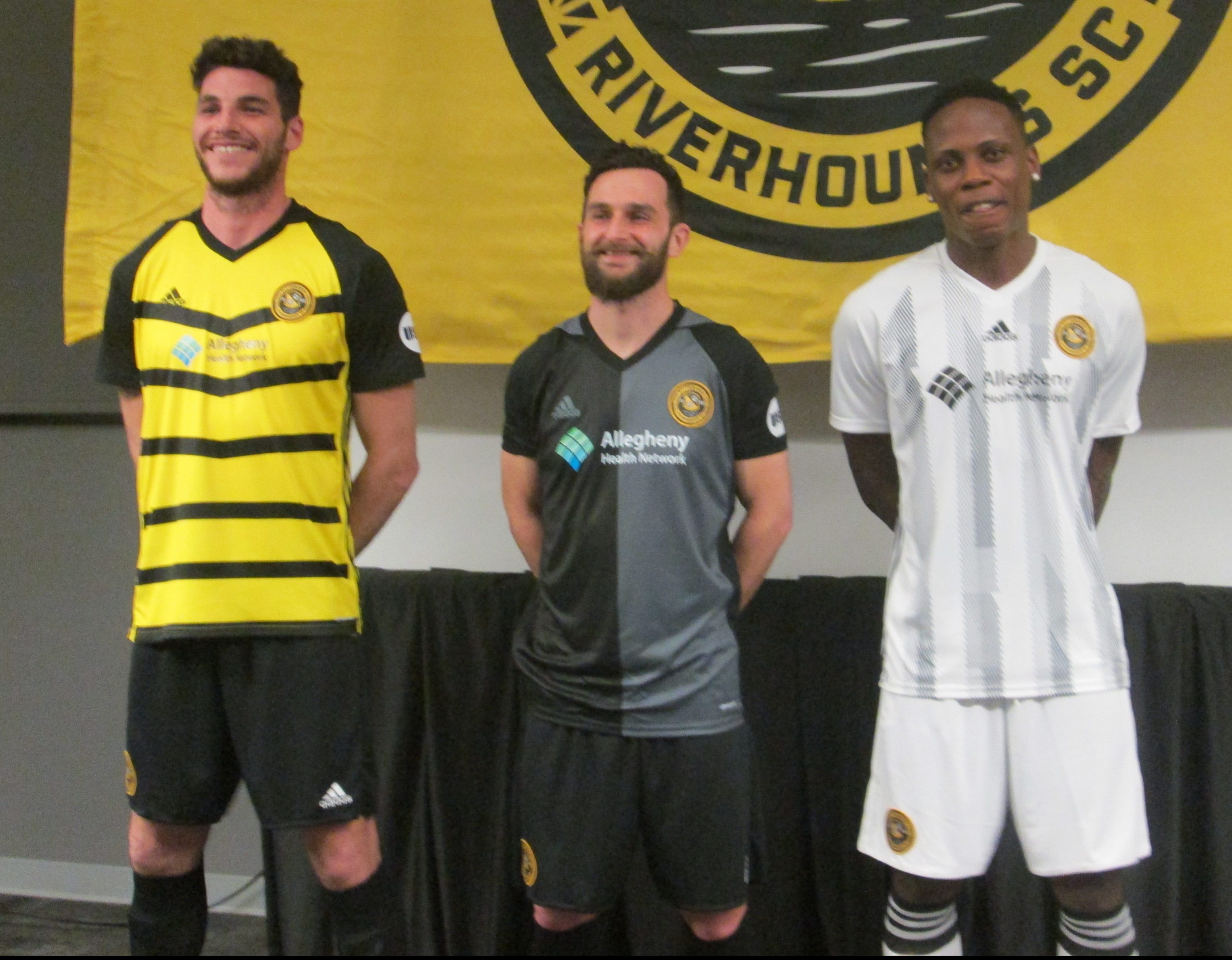
The new badge is rooted in the sporting culture of Pittsburgh. First and foremost, it is adorned primarily in Black and Gold to further solidify the club’s standing alongside the three major professional teams in the city. Traditional colors of the Steel City itself (most notably in the city’s official crest), Black and Gold signifies a considerable shift for the club’s identity from its original “brick and mud” scheme in its inaugural season to the blue used through the opening of Highmark Stadium.
Paying homage to the 446 bridges that grace the landscape of the city, a literal bridge links the words Pittsburgh and Riverhounds SC in the outer band of the badge. The architectural elements are a direct inspiration of Fort Pitt Bridge, which has provided a formidable presence in the West Side backdrop of Highmark Stadium since the club began play at that location in 2013. Furthermore, a checkered pattern anchors both sides of the city name, drawing from the city’s crest as well.
A uniquely shaped shield centered within the badge provides striking character, inspired directly from capstone elements within the entryway of the Allegheny County Courthouse located downtown. Split diagonally in Black and Gold, the crest holds the defining qualities of the club and is bookended by “1999,” the inaugural year of play for the Hounds. Within the shield is a soccer ball, as well as a “Hounds” paw to forever link the club with the Riverhounds name.
The shield is buoyed in the element of water, as the three levels of waves represent the three rivers of Pittsburgh – the Allegheny, Monongahela, and Ohio.
Finally, the typography is custom, in direct inspiration of a wealth of unique examples found throughout the city defined primarily by a flare serif quality.
The new brand identity was developed by Portland, Oregon-based graphic designer, Brian Gundell – briangundell.com. Gundell specializes in graphic design for athletics organizations, having worked with major brands such as Adidas, Nike, Under Armour and numerous professional teams, such as the Miami Dolphins, Miami Marlins, San Francisco Giants, San Diego Padres, LA Galaxy and D.C. United.
The Riverhounds began play in 1999 as a member of the USL-A League. The club has kept the Riverhounds name almost primarily throughout its existence, adding “FC” for a short spell during 2005-06. The addition of SC (short for ‘Soccer Club’) to the club name provides little doubt to what Riverhounds SC represents as a brand moving forward and its place in the soccer world both nationally and globally.
Here’s a look the Hounds crests/logos through the years:


Glory on the Grass

Pittsburgh Riverhounds
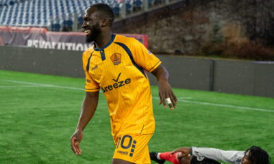
Pittsburgh Riverhounds 2024 Roster Updates and Club News

Pulse of Pittsburgh Soccer
Support Local (Pittsburgh) Soccer! Become a Pittsburgh Soccer Now subscriber today

Miracle on the Mon
‘Miracle on the Mon’ is available now!

Pittsburgh Riverhounds
Riverhounds to host FC Tulsa in US Open Cup Round of 32


Pittsburgh Riverhounds
Riverhounds remain winless; play to second straight scoreless draw at Rhode Island
Pittsburgh Riverhounds
Pittsburgh Riverhounds 2024 Roster Updates and Club News
Pulse of Pittsburgh Soccer
Support Local (Pittsburgh) Soccer! Become a Pittsburgh Soccer Now subscriber today
Miracle on the Mon
‘Miracle on the Mon’ is available now!
Pittsburgh Riverhounds
Riverhounds remain winless; play to second straight scoreless draw at Rhode Island


Pittsburgh Riverhounds
USL Championship Atlantic Division Preview: Familiarity breeds contempt